Sprint 1: Credit card decision points
The Problem
Up until 2021, An Post only offered one credit card option, the ‘Classic’ credit card: https://www.anpost.com/Money/Credit-Card/Classic-Balance-Transfer. When An Post Money introduced a second card option, The ‘Flex’, the stakeholders came to the Digital Experience team to explore how we could visually represent the two cards and their benefits so the customer could chose which one they wanted.
My first port of call was to chose the most appropriate module from our design pattern library, ‘Lugus’, but I felt as though the options were limited (see graphic), and that we could offer more value to our customers in terms of UX and visual appeal. This required a think outside of the box approach, so I decided to use this opportunity to hold a design sprint focused on the following user story:
As a user I need to easily decide which product I want to purchase from An Post Money.


Design Innovation Sprints
anpost.com is built using modules, but from time to time we get a design request from the business where our existing modules do not adequately solve their problem. In these cases, we either have to redesign/improve an existing module to accommodate the request, or create a new one altogether. This problem sparked the idea for us to hold design sprints, based on the book ‘Sprint’ by Jake Knapp, John Zeratsky, and Braden Kowitz. The design sprints enabled us to create bespoke solutions to address day to day UX issues on anpost.com. and proactively add value from the digital experience team. It also enabled us to identify problems and build solutions with product experts, within the BAU 5 day lifecycle framework.
My role: User experience, research, interaction and visual design.
Activities: Research/problem discovery, wire-framing, mock-ups, full spec treatment and prototyping.
Tools used: Figma, Creative Cloud, Jira, Data Studio, Google Analytics.

View the live example at: www.anpost.com/Money/Credit-Card
Existing modules from pattern library
Discovery & Market research
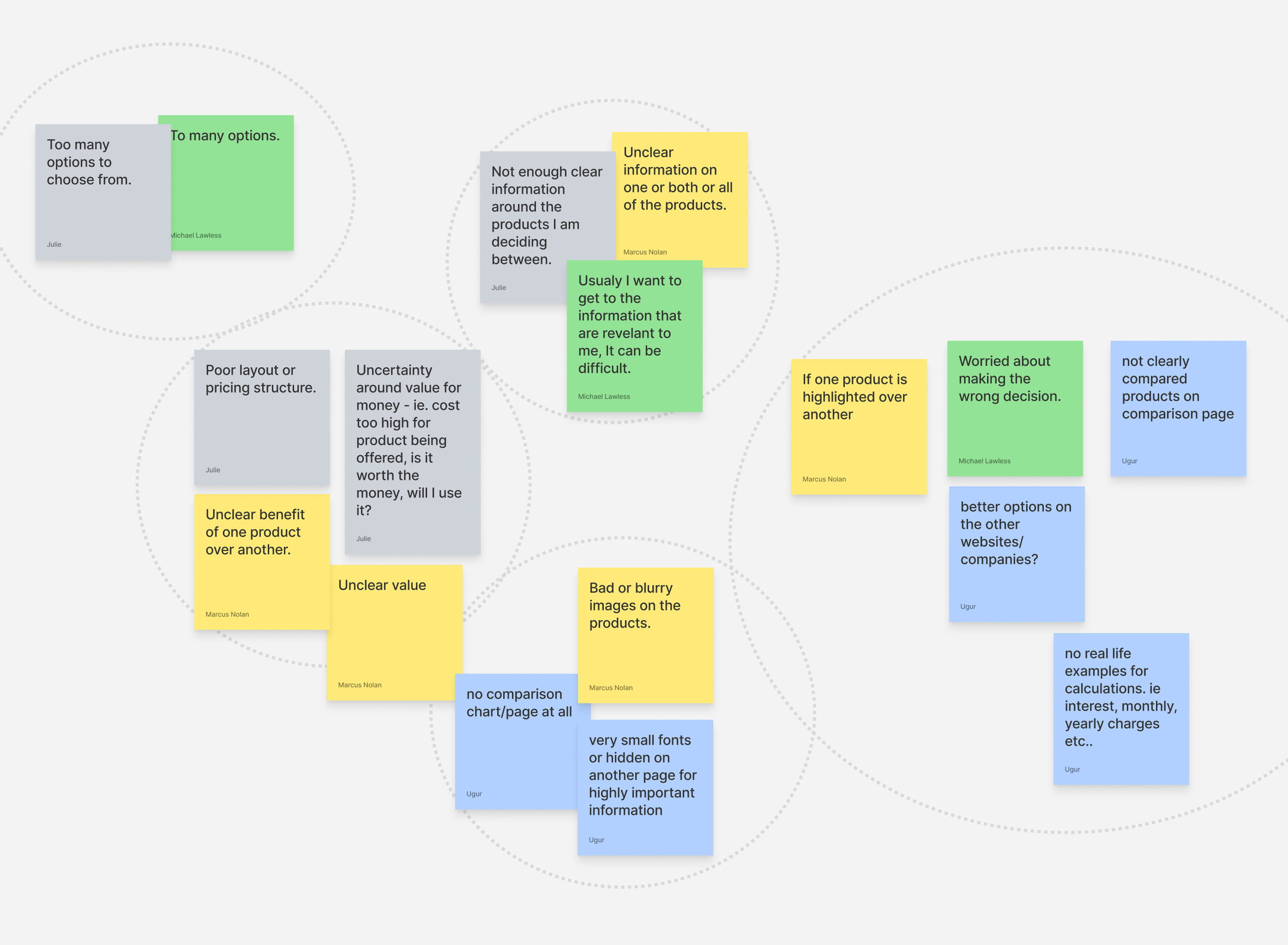
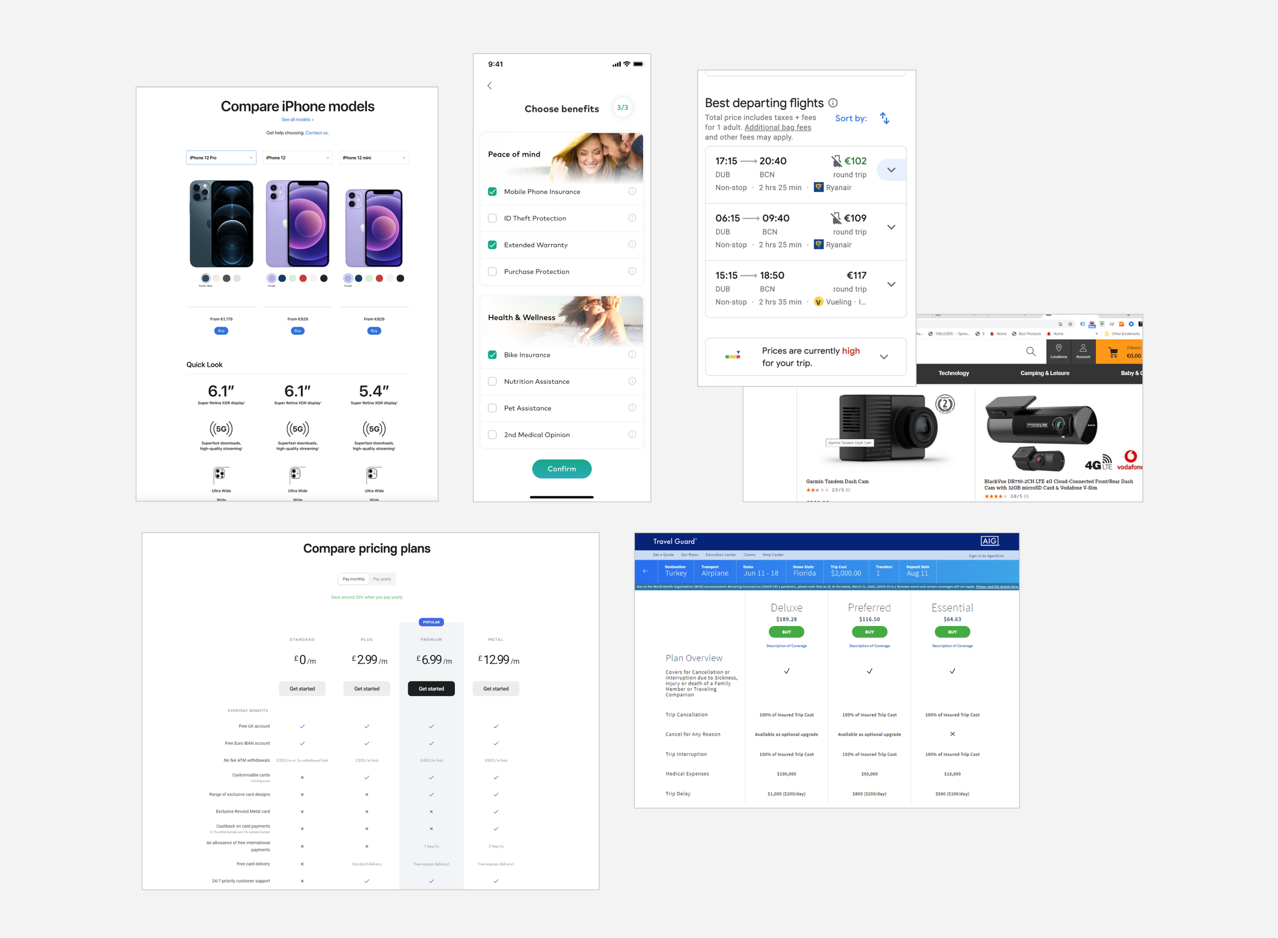
As a team we defined the problem by adding sticky notes of how or where we have previously encountered the problem of not being able to make a decision on a website. We then pieced this into an affinity diagram to identify themes. As a team (max. 4) we researched our favourite websites and digital experiences to bring the latest examples of web design to our workshops. Each team member took screenshots of their competitor analysis and added it to a frame in Figma. We then presented our ideas back to then team, and then held a vote. The presenter also had an additional priority vote.
Wireframing & Mock-up Challenge
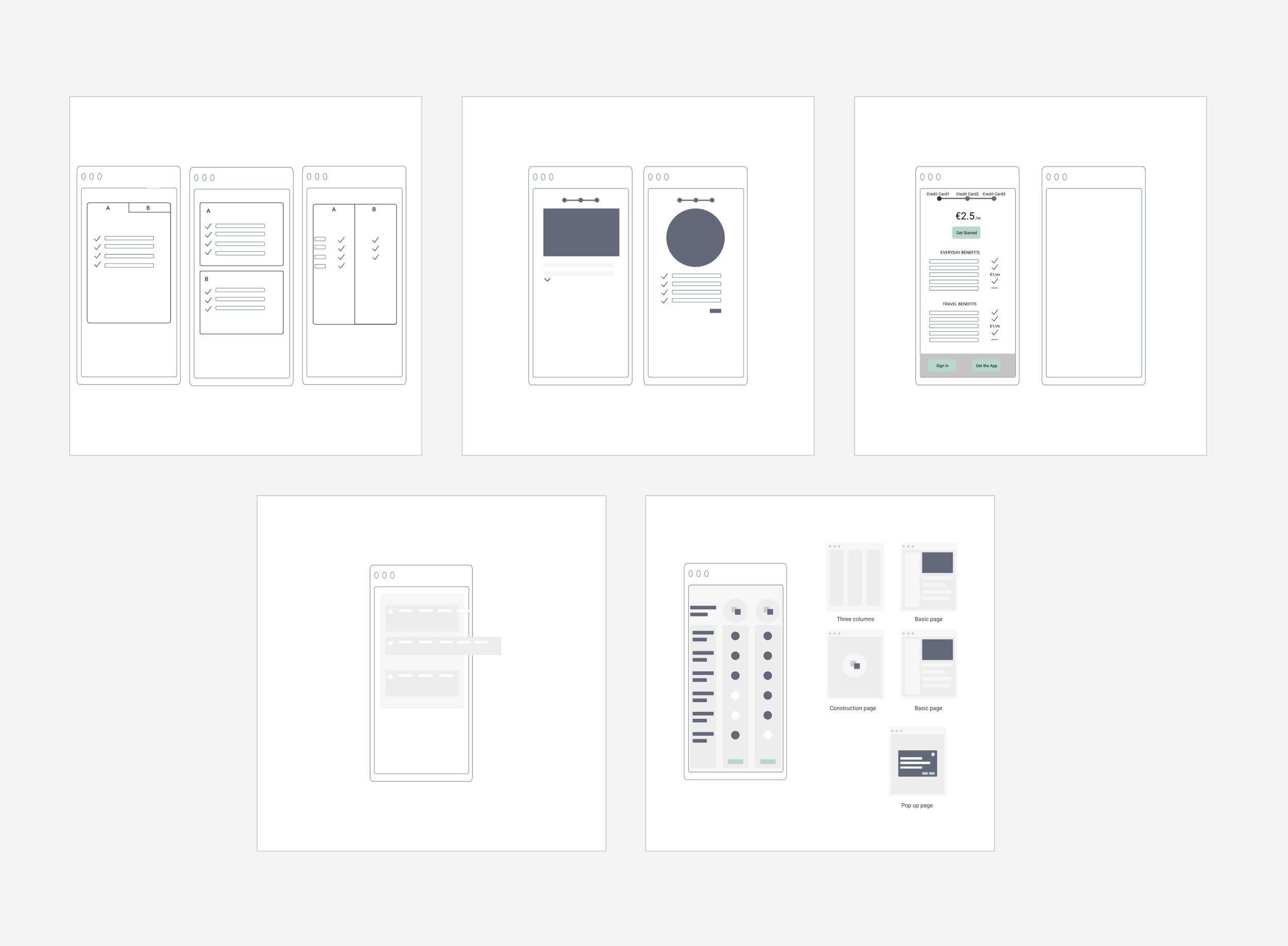
All members of the team then wireframed their vision for the design improvement on a FigmaJam board. The whole team work off the same board and return to presenting and voting. Myself and the other designer on the team then took winning wireframes and created mock-ups. We later presented these wireframes back to the team for feedback.
Full spec treatment & Prototyping
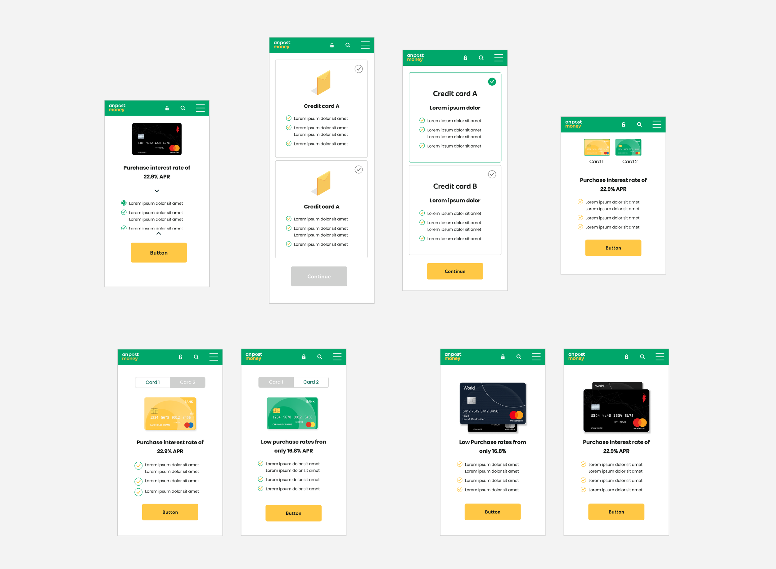
Once a design approach had been agreed upon, we fleshed it out fully producing hi-fidelity prototypes, with consideration for rules, grids, typography, and bringing the aesthetic in line with our design pattern library, ‘Lugus’. We worked closely with our front and back end developers to ensure technical feasibility.


Measuring the impact
CRO Testing
Once the module was released and live on the site, our CRO team conducted an A/B test for this condensed modules on Credit Card landing page to with the objective to drive increased awareness of the Flex credit card offering.
Google Analytics
In November 2021, around 69% of applications chose for the ‘Classic’ credit card, and 31% chose the ‘Flex’ option. The eligibility checker step to ‘Thank you’ conversion was higher for the Flex credit card option.

Sprint 2: Infographics
The Problem
The business came to us looking to publish the infographic below on anpost.com. Displaying information in this way presented a variety of issues for our users, especially around accessibility:
The text was static, not dynamic (HTML5) and this would exclude some users who rely on screen readers to scan and read content for them.
The image worked well in terms of legibility on desktop, but when constrained for mobile the text, especially the smaller font became almost illegible.
The text on the photographic background was problematic for contrast, and did not pass our WCAG 2.0 Level AA accessibility standard.
The infographic looked a bit flat and dull, and there was an opportunity here to make it more fun, colourful and enticing to read.
The opportunity for us was to create a digital solution where infographics could sit on the website and be both mobile friendly and accessible for all users.
To start, I created the following user stories:
As a user I want to see information presented in a clear and concise format.
As a user with visual impairments - I want to have this information communictated to me via screenreader in a logical and liner fashion
As a user I want to be able to read text on my phone.
As a business owner I want to communicate information to the user in a light visual way.
As a business owner I want to display the most relevant information to the user.


Final Outcome:
Research/Discovery Phase
Through Google Analytics, we investigated the the most common devices that visit anpost.com (mobile accounts for over 80% of traffic to the site) so we could challenge ourselves to design for the smallest screens and test our designs on the most frequently used ones. As a team we each conducted desk research to find examples of sites that solve similar problems. It was actually quite challenging to find good examples, as there didn’t appear to be any existing dynamic infographic online.

Mock-up Challenge
In a group call with three team members (Including myself), we set a timer to create low fidelity mock-ups based on our research on a FigmaJam board. Each person then presented their idea, and we voted for our preferred option using coloured stickers. Myself and the other designer on our team then took the winning mock ups and used these as a starting point to create more fleshed out wireframes.


Prototyping
Once the mock-up challenge was complete, myself and the other designer on the team worked through the prototyping process. We always design with a ‘mobile first approach’, so we spent more time working through a solution that would work really well on mobile before moving to desktop, which was less of a challenge. We designed these using existing components and fonts from our design pattern library, but did not restrict ourselves by sticking rigidly to the brand guidelines.

Technical spec for front end
Working out grids, rules for padding, structure, layout etc. for hand over to our front end developer.